I Love the 90s, Part II
A unique design language takes hold.
This is the second in a multi-part series on the lasting impact of the 1990s on the watch industry as it exists today. Each week in August will see a new addition to this series. You can read Part I here.
Before I get further into this endeavor, I should cop to something. I don’t really remember the 90s. Sure, I was alive, but I was born in 1996, so my memories of the decade are pretty limited, or are rooted in the Nick at Nite reruns of that permeated my childhood TV viewing.
That said, the 90s certainly had a profound impact on my experience of the early aughts. I don’t think it’s a particularly novel idea for me to suggest that the bleeding effect between decades is more pronounced than documentaries, media, and our general desire to simplify history would suggest.
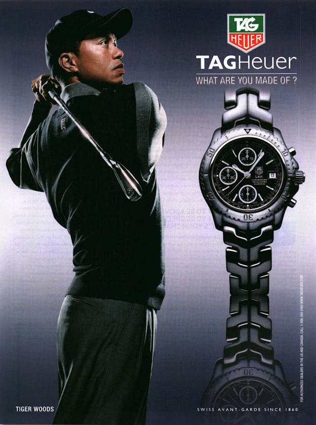
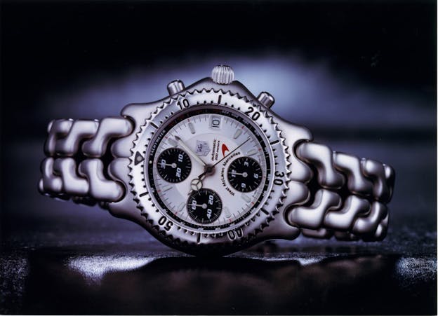
So it is with all that in mind that I say the following. The first watch I remember noticing and paying attention to is the TAG Heuer Link. The Link was an advertising fixture when I was a kid. Omnipresent and noticeably different than anything else on the market, the Link certainly had an impact on me and my taste.
The question a lot of people ask me when I share this is, at its surface, a pretty simple one: “Why?”
A New World Order
It’s a fair question, if only because the Link line has fallen out of favor — although, that TAG still produces a line of Link watches is likely testament to the idea that there is some merit to the model. But the Link and the “Sport Elegance” (S/El) that preceded it are prime examples of something some would prefer to ignore: That the 90s truly had a design language all their own.
As I mentioned in my introduction to this series, the watch industry was really only just recovering from the Quartz Crisis by the time the 90s rolled around. And while the Crisis certainly had myriad detriments to the industry, it also had a handful of positive effects.
Chief among these was that the Quartz Crisis was a reset. With cheap quartz watches flooding the market, brands were no longer competing for the wrist time of the uninterested — if someone needed a watch purely to tell the time, cheap and quartz (if not digitial) was the way to go — but were instead actively trying to make a statement, one decipherable and understood by people who cared about what they wore on their wrists.

Otherwise put, the choice to wear a mechanical watch had become just that — a choice. A statement of intent meant to display some part of your personality, and watches of the 90s demonstrated this beautifully.
Unlike Anything That Came Before
If you were to gather watches from the last century in a lineup, picking out the 90s watches would be an easy task. There is a signature aesthetic, sometimes challenging to put into words, that helps to characterize the watches of that decade.
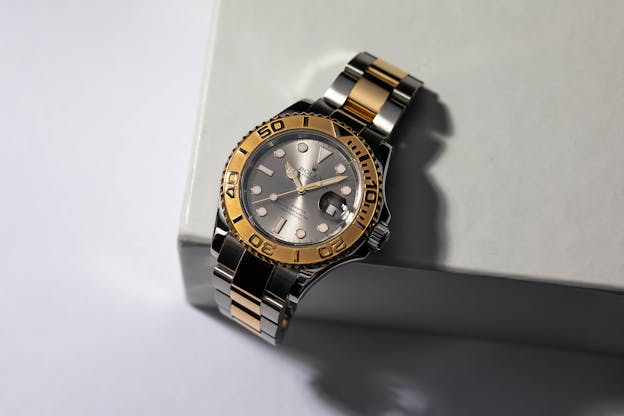
Softened edges, hints of a move towards larger case sizes, and a new approach to materials defined the era, and no one was spared this aesthetic. Even Rolex (notoriously consistent in its design language) bent the knee slightly in the direction of the era’s rounded tendencies. When Rolex introduced the Yacht-Master in 1992, it set itself apart from the Submariner not only with its use of precious metals but by replacing the crisp angles found on the classic Oyster-cased dive watch with radiused transitions, and an overall less toolish look.
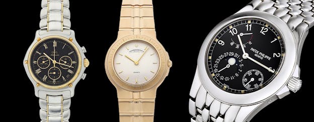
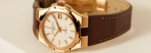
Other standouts of this aesthetic include the Vacheron Constantin Phidias, the Ebel 1911 Chronograph, and the Patek Philippe Neptune, each of which has aged incredibly well, at least to my eye. And it’s always worth remembering that the Neptune 5085/1A preceded the Nautilus 3712/1A by the better part of a decade, making it the first complicated integrated bracelet steel sports watch from Patek to make it to regular production.
The Third Way
On the other end of the spectrum, the rise of Panerai offered a glimpse into the industry’s future, as movie stars like Sylvester Stallone and Arnold (do I even need to say his last name) gravitated towards massive watches that matched their impressive frames.
Straddling the fence between the two trends was a watch from one of Switzerland’s most important brands, Audemars Piguet. Introduced in 1993, the Royal Oak Offshore, designed by Emmanuel Guiet and internally nicknamed “the Beast,” took the premise of the Royal Oak and brought it crashing into the 90s.
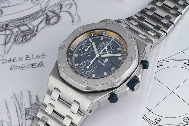
A behemoth (at the time) at 42mm across and 15mm thick, the Offshore also featured a softened look, with the sharp case angles of the original Royal Oak replaced with a more rounded, almost bubbly, design. 30 years later, it’s hard to fathom that AP approached the launch of this now staple with serious trepidation. The first 100 Offshores didn’t even have the “Offshore” name anywhere on the case — AP didn’t want to commit to burning a good name on what they considered likely to be a flop.

Somewhat ironically, Gerald Genta, who created some of the most exciting and out-there designs of the decade, was vehemently opposed to the Offshore, a feeling he would share indiscriminately and publicly.
But while some watches were getting bigger, that didn’t mean that small watches were being left behind. You only have to look as far as the Cartier Panthère to understand that the market for small quartz watches intended for women was as hot as it has ever been.

This was no small thing. The Cartier, along with the Ebel Beluga and a whole host of other well-designed quartz watches, made high-end quartz viable. This viability would be critical as the technical side of mechanical watchmaking shifted into gear again, but that’s a topic for next week.

