The Pocket Square Effect: The Little Things That Make Or Break A Watch Design
The pocket square is the most ubiquitous, underrated outfit-making detail any well-dressed man can utilize, but I bet you never realized it.
Life is complicated. It is filled with tiny minute details that flutter by us all the time. It’s hard to stop and wonder about the how and why. The brain is not meant to and cannot simply process every detail of life, from colors to shapes; sounds merge into one to create what I call “summary images.”(Or as Jack calls it “unified cognitive gestalt”.)
When you look at a picture of a bunch of trees, and someone asks you what you see, generally you will tell them you see a forest. Why? Because you see green leaves, brown branches, and the deductive detective you are, from years of watching Scooby-Doo reruns and reading Dan Brown novels, has caused you to take all the information and create the statement—it is a forest.
However, when it comes to horology—where details are seemingly the stuff of life (technically it is the “staff of life” which was first attested in 1638 per Merriam Webster, but I will stick with how I have always said it) —it is easy to get lost in them, to become jaded by them. But every once in a while—one stays. One sticks out. It holds your attention and causes a sensation of admiration for the piece.
Don’t get me wrong; I am under no illusion that this flavor may not tantalize every taste bud, but the reality is that for us watch lovers, the beauty is truly in the details.

If you look hard enough, you can find joy in the details of horology. It could be a red-tipped second hand, a hidden Easter egg, a wink to the watchmaker, the company’s history on the crystal, or something buried deep behind the caseback. It is these little nods to history, to the creators, to a moment and time in history that just catch your attention. The pocket square is an underrated accoutrement of the sartorial world. It is a subtle display of personality, pizzazz, and fashion that can be overlooked. And, like the pocket square, these little details can make the difference between a watch looking well dressed, and really dressed up..
Where it all started: “The Watchmakers 4”
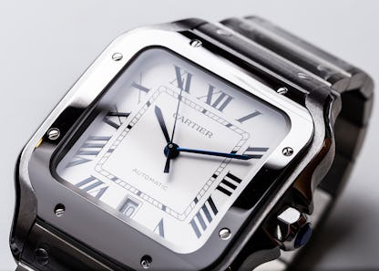
My first luxury watch was a Frederique Constant Slimline. I still remember the feeling of opening the box that seemed far too big for the watch inside and seeing the guilloché dial, small seconds subdial at 6 o’clock, and Roman numerals. I was young and knew I liked nice watches, but the details alluded me, including how to correctly pronounce guilloché. After a few weeks on the wrist, I was standing in line at Duane Reade when my buddy asked me the time. I looked down and said, “it’s four… wait. I think it’s four thirty.” It was then I noticed the watchmaker’s 4. The watch had IIII instead of IV. And so started my obsession with understanding why anyone would use IIII over IV. Surely there is only one way to write the number 4 in Roman Numerals. What I ended up learning is a lesser-known fact ingrained deep in horological history.

Various theories attempt to explain the use of “IIII” instead of “IV” on clock faces, rooted in deliberate choices rather than errors. One theory traces back to the Roman Empire, where the numeral 4 was often represented as “IIII,” potentially to avoid conflict with the Latin alphabet and fear of divine retribution from the god Jupiter.
Another theory dates to King Charles V of France in the 14th Century, who believed “IV” brought bad luck and ordered the use of “IIII.” Some attribute the practice to Louis XIV, “The Sun King,” who might have disliked seeing part of his name on a humble watch dial. Limited literacy in ancient times could also explain the preference for “IIII,” as it was easier for uneducated citizens to comprehend.
Aesthetic considerations play a role too, as the symmetry of using “IIII” alongside “VIII” at 8 o’clock contributes to a visually pleasing dial arrangement. Watch designers often favor this arrangement for its elegance and balanced progression. The watchmaker’s 4 can be found on a myriad of brands and models, most notably Cartier.
Omega engraving hidden in the hesalite crystal.

A few years later, I walked into the Omega Boutique in NYC to purchase an Omega Speedmaster in celebration of a personal milestone. As I chatted it up with the salespeople, discussing the well-documented history of the Speedy and all its little quirks, the man sizing my bracelet chimed in. He said, “You chose the best version, the hesalite.” I knew why I chose it—it was the closest version available that emulated the watches which actually went to space, but why did he think so?
He gestured for me to come closer and then handed me a loupe. I mistakenly placed it against my eye backward (novice mistake). He pointed to the center of the crystal and said, “look at this little Easter egg.” Once I embarrassingly turned the loupe around, my eyes widened as a small Omega symbol appeared.
And it’s this detail I point out to all my skeptical friends who question my love of watches. I say, “here, look at this detail.” As if this detail is evidence of everything the watch embodies; history, provenance, craftsmanship, and care.
From that moment on, I became obsessed with finding the little details of watches that often go overlooked and pushed to the side. The pocket squares of the horological world. In a world steeped with minute details, narrowing down the best “pocket squares” was tortuously difficult. It was like staring at a roadside diner menu, too many options to choose from, leading to full-on menu anxiety. However, due to my horrible short-term memory, I have habitually written my favorite “pocket squares” down over the years.
Breguet Classique Grande Complication Ref. 5317.
Our very own Tim Mosso brought my most recent “pocket square” to light when he recently wrote a piece about the Breguet Classique Grande Complication Ref. 5317. Found discreetly hidden on the upper flank of the hour track is a discrete etching. Tim pointed out that “The pantograph-cut “Breguet” micro scripts on the upper flank of the hour track are known as a “secret signature,” but like it’s printed counterpart at Cartier, this “secret” is a history play more likely to elude aging eyes than counterfeiters.”

Breguet actually used pantograph cut secret signatures on his dials as his work was enthusiastically faked during his lifetime. It is unclear if the modern brand uses a pantograph anymore, as they appear stamped, but the jury is still out.
Vacheron Constantin ref. 4240 and Patek Philippe ref. 5320G-001
I always tend to favor the underdog due to some predisposed condition I am unwilling to unpack, but my favorite of the “holy trinity” has to be the most overlooked, and that is Vacheron Constantin. The Vacheron Constantin ref. 4240 was released in 1942. This significant release coincided with a partnership between Vacheron Constantin and Jaeger-LeCoultre aimed at navigating the economic downturn due to WWII. The movement of the Triple Date in the ref.4240 was based on a JLC movement, highlighting the collaborative efforts during this period.
Recognized as one of the best designs of its era, the Triple Date gained iconic status, prompting Vacheron Constantin to reintroduce a steel version in 2017 as part of its Historiques collection.

This re-release not only stands as a remarkable timepiece but has also revitalized interest in the original model, solidifying its place as a popular and enduring choice within the brand’s lineup. Knowing the context of this watch, the “pocket square” that stands out to me is its use of colors. Specifically, the red “railroad” track around its outer edge.
Watches from the 40s are generally not that loud. Color is rare outside of that given by the metals used. Yet, the subtle red track is a small detail that makes the watch. I love when a dress watch can pack a punch, and sometimes it is the smallest details that allow you to be rocked in the face. That red minute track is unassumingly beautiful when contrasted with the rest of the dial layout. It blends in when it needs to and attracts attention just at the right moment as well.
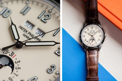
Staying along the same theme, the next “pocket square” is the red 1 on the Patek Philippe 5320G-001. After much research, the best reason I can find for this small red 1 is to differentiate between the 31st of the month and the 1st.

When you look at a ref. 1526 (Patek’s first perpetual calendar) which was released in 1941, the 1 and 31 look very crowded. Upon closer examination, it even seems as though the spacing looks off between the dates. However, the center line of each date/numeral the distance in degrees is actually the same. Despite looking like the 1 is closer to the 31 than the dot for the 30th, in the end, it is just an optical illusion.
John Reardon’s Pocket Square
Patek has a history of very subtle design features that excite the watch community. When doing research for this article, I reached out to John Reardon of Collectability who brought to light his favorite “pocket square” which resides on the ref. 5110.
“My favorite easter egg is the fact that Dacca is technically spelled incorrectly on ref. 5110, a mistake quietly fixed with the introduction of the ref. 5130 circa 2006 when Patek corrected the error and wrote Dhaka instead,” Reardon said.

Reardon, who worked for Patek Philippe, went on to say that this misspelling was understandably not well-received by the Bengalis and he likes to believe it was his personal suggestions that led to a correction of this mistake. The correction to Dhaka on the ref. 5130 allowed for the name to align more closely to the Bangla pronunciation.
Patek Philippe ref. 1578
Another pocket square from Patek appears on the ref. 1578. The early editions from the 40’s use the cal. 12″‘120, which stands out not only as a remarkable movement but also as a pivotal one. Those versed in the history and passion of watchmaking are aware of the significance this caliber holds for Patek Philippe. It proudly claims the title of being the inaugural in-house movement that fueled the iconic Ref. 96 Calatravas. Simply put, Cal. 12″‘120 breathed life into the vertically integrated production, marking a crucial milestone for what is arguably the most essential line of dress watches in the realm of timepieces.
But that’s not what I love. I love the radial dial with its rotated 3 and 9 Arabic numerals. It adds a quirk to a very serious dress watch. Watches can and should be quirky and fun.

The reality is that one could write an endless article with all the pocket squares of the horological world. However, to me, just like choosing an outfit, the ones you fall in love with are undeniably personal and reflect one’s own values.
Delving into the “pocket squares” of horology is akin to embarking on a captivating journey where love for watches transcends the mere ticking of hands. It’s an affair with the small details, the microscopic intricacies that transform a timepiece into a work of art. Much like a thrilling novel, the magic lies in the minutiae—the delicately engraved patterns, the subtle dance of gears, and the meticulous craftsmanship. These details are the vibrant strokes that paint the canvas of a watch’s story, weaving together a narrative that echoes the rich tapestry of horological history. It’s in these little nuances that our fascination takes root, and, much like a treasure hunt, discovering each detail unravels a tale of passion, precision, and timeless elegance.
So what is your pocket square?

