Bicompax – the Panda, Zorro, and co.
Do good things always come in threes? Not always. For the majority of chronographs, counting minutes and seconds is enough. In which case, you only need two counters. Here’s a brief history of some great chronographs – and how they deal with these essentials.
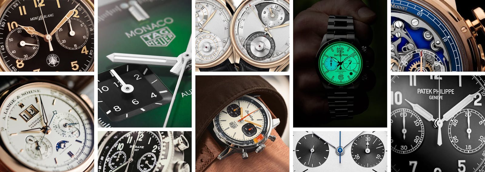
As all good collectors know, the most coveted chronograph is an animal. Nicknamed the panda, it’s the archetype of the bicompax chronograph (bicompax literally meaning that it has two counters). Its two black openings on a white background make it simple and thus readable. Seconds are displayed on the left, and the minutes on the right, usually spanning 30 or 45 minutes; one example is Habring’s Felix Panda.

Achieving different watchmaking styles for a bicompax is nigh-impossible. In the vast majority of cases, the two counters are on the 3 o’clock-9 o’clock axis, usually to balance the vertical axis, along which the brand’s logo and/or the date are generally positioned. Breguet’s Type XXI and Dodane’s Type 23 are examples of bicompax chronographs for military use. Could there really be any alternatives?


From Panda to Zorro
The easiest option turned out to be that of swapping the colors over. And so the panda became the ‘reverse panda’: a dark background on which two white counters stand out. Breitling took the idea one step further with its Top Time, featuring a dark triangular swath of dial beneath each counter: a look that was less panda, more Zorro.


From Round to Square
When it comes to shapes, the circle predominates: indeed, it’s hard make a central hand rotate round anything other than a perfect circle. Nevertheless, some brands have tried more angular approaches. One such example is the TAG Heuer’s iconic Monaco, whose square shape is mirrored by the square chronograph counters.

Light Relief
There remains the realm of materials and finishes. To provide a good view of frequently small hands moving slowly around counters that are themselves quite limited in size, watchmakers often use a surface treatment that differs from that used on the rest of the dial. In most cases, a circular guilloche pattern is used – as on Montblanc’s Origins chronograph.

Another option is to locate the two counters slightly beneath the main surface of the dial, a solution that has been widely used to add a subtle relief effect to a watch face, as on Patek Philippe’s 5172G. Alternatively, brands may opt for Super-LumiNova. The most striking example is without question the Bell & Ross BR V2-94, in which the entire dial, including the bicompax chronograph, is luminous.

Discussion of finishes would not be complete without mentioning the rarity of skeleton bicompax chronographs. The finest example comes from Ateliers Louis Moinet. The brand has created Memoris, a rare timepiece whose master complication, a bicompax chronograph, has been flipped in its entirety to the dial side, consigning the time-telling function of the movement to the relative obscurity of the caseback.

A Mysterious Bicompax
For its part, Montblanc pulled off a major innovation in 2010 when it unveiled the Metamorphosis. The timepiece offered a twofold surprise: for one thing, the counters were arranged vertically, on the 12 o’clock-6 o’clock axis. Moreover, they could not be seen at first glance – a pusher had to be activated to view the bicompax chronograph, drawing the dial back like theatre curtains to reveal the chronograph. It was a radical and wholly original development.

Looking Forward
Clearly, the bicompax chronograph has not yet had its final say, and remains the focus of intense creativity. Even within the constraints of two simple, neatly-aligned counters, watchmaking firms can get it to do a lot more than simply measure time – as A. Lange & Söhne has done with their Datograph Perpétuel Tourbillon, in which the bicompax is home to an entire perpetual calendar.


